Creating a Dynamic Grid Layout Using CSS Variables
Create dynamic grid layout structure with the power css variables.
In this tutorial, we’ll learn how to make grid layout dynamic with power of CSS variables.
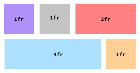
Let’s take an example here: We want to craft the same layout as shown in the post cover picture.
Traditionally, achieving this layout would involve the following code snippets:
HTML Structure
<div class="custom-grid-1"></div>
<div class="custom-grid-2"></div>
Associated CSS Styles
.custom-grid-1 {
  display: grid;
  grid-template-columns: 1fr 1fr 2fr;
  grid-template-rows: auto;
}
.custom-grid-2 {
  display: grid;
  grid-template-columns: 3fr, 1fr;
  grid-template-rows: auto;
}
In the above exaple, we’ve used same content twice.
Imagine we want way more complex layout then this. There’s a better approach to designing dynamic grid layouts by strategically integrating CSS variables within HTML, effectively utilizing them within your styles.
Let’s rewise the previous snippet:
HTML Structure
<div class="grid" style="--col: 1fr 1fr 2fr; --row: auto;"></div>
<div class="grid" style="--col: 3fr 1fr; --row:auto;"></div>
CSS Styles
.grid {
  display: grid;
  grid-template-columns: var(--col);
  grid-template-rows: var(--row);
}
By using this approach you can create any dynamic & complex grid/layout without creating a multiple classes.
However, this approach is not limited to layout structuring; you can extends it to property assignment within the grid class itself, making your design process agile, resourceful, and adaptable.
Thanks for reading!