Tag Cloud with Interactive Hover
An animated tag cloud featuring seamless 3D rotation, scaling and highlighting on hover, alongside full GSAP Flip filtering capabilities to smoothly navigate content topics.
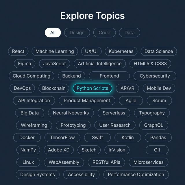
Give users a stylish and gamified way to navigate topics, categories, or keywords with an animated Tag Cloud. This implementation relies on GSAP Flip for smooth DOM layout rearrangement while filtering tags, alongside pure CSS preserve-3d paired with mouse tracking for an enjoyable perspective tilt effect on desktop.
HTML Architecture
Group tags within a flex container wrapped in a perspective-enabled node. Use data-category attributes to define the topics your tags belong to for filtering.
<!-- Filter Buttons -->
<div class="filters">
  <button class="filter-btn active" data-filter="all">All</button>
  <button class="filter-btn" data-filter="design">Design</button>
  <button class="filter-btn" data-filter="code">Code</button>
</div>

<!-- 3D Perspective Container -->
<div class="cloud-container" id="cloud-container">
  <div class="tag-cloud" id="tag-cloud">
    <div class="tag" data-category="design">UI/UX Layout</div>
    <div class="tag" data-category="code">React.js</div>
    <div class="tag" data-category="design code">CSS Animation</div>
  </div>
</div>
CSS Configuration
The logic utilizes CSS custom properties (--rotate-x, --rotate-y) on the .tag-cloud element allowing Javascript to freely mutate the orientation angles without directly writing complex string transformations inside a loop.
To enable true 3D popping when hovering a .tag, apply transform: translateZ(40px).
.cloud-container {
  max-width: 800px;
  perspective: 1200px; /* Crucial depth */
}

.tag-cloud {
  display: flex;
  flex-wrap: wrap;
  gap: 1.25rem;
  transform-style: preserve-3d;
  /* Controlled by JS MouseTracking */
  transform: rotateX(var(--rotate-x, 0deg)) rotateY(var(--rotate-y, 0deg));
}

.tag {
  transition: all 0.4s cubic-bezier(0.25, 0.8, 0.25, 1);
  transform: translateZ(0) scale(1); /* Reset state */
}

/* Hover effects */
.tag-cloud:hover .tag {
  opacity: 0.3; /* Blur unfocused siblings */
  transform: translateZ(0) scale(0.95);
}

.tag-cloud .tag:hover {
  opacity: 1; /* Retain focus */
  transform: translateZ(40px) scale(1.15); /* Pop out in Z Space */
  z-index: 10;
}
JavaScript Integration
Include GSAP Core alongside the GSAP Flip plugin.
The FLIP (First, Last, Invert, Play) animation technique allows the elements to seamlessly reflow around the Flexbox layout as neighboring categories are quickly toggled on and off via inline display: none mutations.
gsap.registerPlugin(Flip);

const container = document.getElementById("cloud-container");
const tagCloud = document.getElementById("tag-cloud");
const filterBtns = document.querySelectorAll(".filter-btn");
const tags = document.querySelectorAll(".tag");

// 1. 3D Mouse Tracking Tilt
container.addEventListener("mousemove", (e) => {
  const rect = container.getBoundingClientRect();
  const normalizedX = (e.clientX - rect.left - rect.width / 2) / (rect.width / 2);
  const normalizedY = (e.clientY - rect.top - rect.height / 2) / (rect.height / 2);

  tagCloud.style.setProperty("--rotate-x", `${normalizedY * -15}deg`);
  tagCloud.style.setProperty("--rotate-y", `${normalizedX * 15}deg`);
});

container.addEventListener("mouseleave", () => {
  tagCloud.style.setProperty("--rotate-x", "0deg");
  tagCloud.style.setProperty("--rotate-y", "0deg");
});

// 2. CSS Fliping with GSAP
filterBtns.forEach(btn => {
  btn.addEventListener("click", () => {
    // Save current positions inside Flexbox
    const state = Flip.getState(tags);
    const filter = btn.getAttribute("data-filter");

    // Hide or Reveal elements (The DOM jumps instantly)
    tags.forEach(tag => {
      const match = filter === "all" || tag.getAttribute("data-category").includes(filter);
      tag.style.display = match ? "block" : "none";
    });

    // Animate gracefully from the saved positions to the new ones
    Flip.from(state, {
      duration: 0.6,
      ease: "power3.inOut",
      absolute: true, // Prevents elements pushing each other during transition
      stagger: 0.05,
    });
  });
});
By separating hover-states via CSS classes and utilizing GSAP strictly for layout flips, performance stays incredibly light on browser rendering threads.