Spotlight Card Hover Effect
A sleek and modern spotlight effect that follows the mouse cursor, revealing a gradient or image underneath the card surface using a radial gradient mask. Perfect for highlighting features.
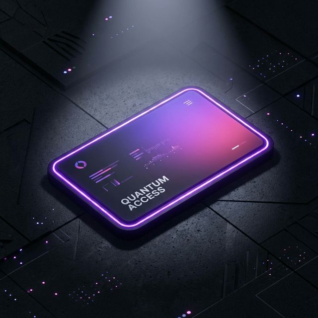
Create a stunning interactive card experience where a “flashlight” or “spotlight” follows the user’s cursor, revealing borders or content underneath. This effect adds depth and a premium feel to any grid layout.
HTML Structure
The structure is simple: a container holding multiple cards. Each card has a div for the spotlight content and the main content.
<div class="cards-container">
  <div class="card">
    <div class="card-border"></div>
    <div class="card-content">
      <i class="icon">✨</i>
      <h3>Magic Reveal</h3>
      <p>Hover over me to see the spotlight effect in action.</p>
    </div>
  </div>
  <!-- More cards... -->
</div>
CSS Styling
We use CSS variables to track the mouse position (--x and --y). The spotlight effect is achieved using radial-gradient as a mask or background.
.card {
  background-color: rgba(255, 255, 255, 0.1);
  border-radius: 12px;
  position: relative;
  overflow: hidden;
}

.card:hover::before {
  opacity: 1;
}

.card::before {
  content: "";
  position: absolute;
  top: 0;
  left: 0;
  right: 0;
  bottom: 0;
  background: radial-gradient(
    800px circle at var(--x) var(--y),
    rgba(255, 255, 255, 0.1),
    transparent 40%
  );
  opacity: 0;
  transition: opacity 0.5s;
  pointer-events: none;
  z-index: 3;
}
JavaScript Implementation
A small script tracks the mouse movement over the container and updates the CSS variables for each card.
document.querySelector(".cards-container").onmousemove = e => {
  for(const card of document.getElementsByClassName("card")) {
    const rect = card.getBoundingClientRect(),
          x = e.clientX - rect.left,
          y = e.clientY - rect.top;

    card.style.setProperty("--x", `${x}px`);
    card.style.setProperty("--y", `${y}px`);
  }
};