Advanced Scroll Progress Indicators
A comprehensive set of 3 smooth scroll progress indicators: top bar, circular ring, and a section-aware side nav tracker.
Don’t let your visitors get lost on long pages. These Advanced Scroll Progress Indicators provide instant visual feedback on reading progress, boosting user engagement and time-on-page.
The 3 Styles Included
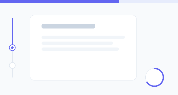
- The Minimal Top Bar: A ubiquitous, sleek horizontal bar fixed to the top edge of the browser that fills continuously as you scroll.
- The Floating Circular Ring: A bottom-corner floating widget using an SVG stroke dash array to draw a perfect circular progress ring. It doubles pleasantly as a “back to top” button!
- The Section-Aware Side Tracker: A vertical timeline-style indicator that not only tracks total scroll, but highlights exactly which section the user is currently reading based on position.
Design & Performance Highlights
- Hardware Accelerated: The progress values are calculated via Javascript
requestAnimationFrameand applied using CSSscaleand SVGstroke-dashoffsetfor perfectly smooth, non-janky 60fps rendering. - Dynamic Theme Changing: The Javascript implementation includes an intersection observer that detects
data-colorattributes on your HTML sections, dynamically shifting the tracker’s accent color as you read! - No Heavy Libraries: Entirely built in vanilla JS and CSS. No need to load massive animation libraries like Framer Motion or GSAP just for a scroll bar.
Implementation Snippets
The Top Bar Tracking Math
Getting the total scroll percentage is straightforward mathematics, but doing it performantly requires updating the CSS variables directly rather than re-rendering widths.
window.addEventListener('scroll', () => {
  // calculate total available distance to scroll
  const scrollDistance = document.documentElement.scrollHeight - window.innerHeight;
  // calculate current read percentage
  const progressPercentage = (window.scrollY / scrollDistance) * 100;

  // Apply to a CSS variable
  document.documentElement.style.setProperty(
    '--scroll-progress',
    `${progressPercentage}%`
  );
}, { passive: true }); // passive flag improves scrolling performance
The Circular Ring SVG Magic
Instead of relying on clunky border hacks, we use an HTML5 SVG circle. By calculating its total circumference, we can use CSS stroke-dashoffset to reveal precisely what is scrolled!
<svg width="60" height="60" viewBox="0 0 60 60">
  <!-- Track -->
  <circle cx="30" cy="30" r="26" stroke="#f1f5f9" stroke-width="4" fill="none" />
  <!-- Progress Fill -->
  <circle class="ring-progress" cx="30" cy="30" r="26" stroke="#3b82f6" stroke-width="4" fill="none" />
</svg>
.ring-progress {
stroke-dasharray: 163.36; /* Circumference = 2 * PI * r (26) */
stroke-dashoffset: calc(163.36 - (163.36 * var(--scroll-progress-decimal)));
transition: stroke-dashoffset 0.1s ease-out;
transform: rotate(-90deg);
transform-origin: 50% 50%;
}Experiment with the styles, implement the exact tracker that fits your layout, and provide your readers with excellent contextual UX!