Glassmorphic Navigation Menu
Modern navigation bar with frosted glass effect (backdrop-blur), subtle gradient overlay, and floating appearance. Smooth dropdown animations, active state indicators, and mobile hamburger menu transition.
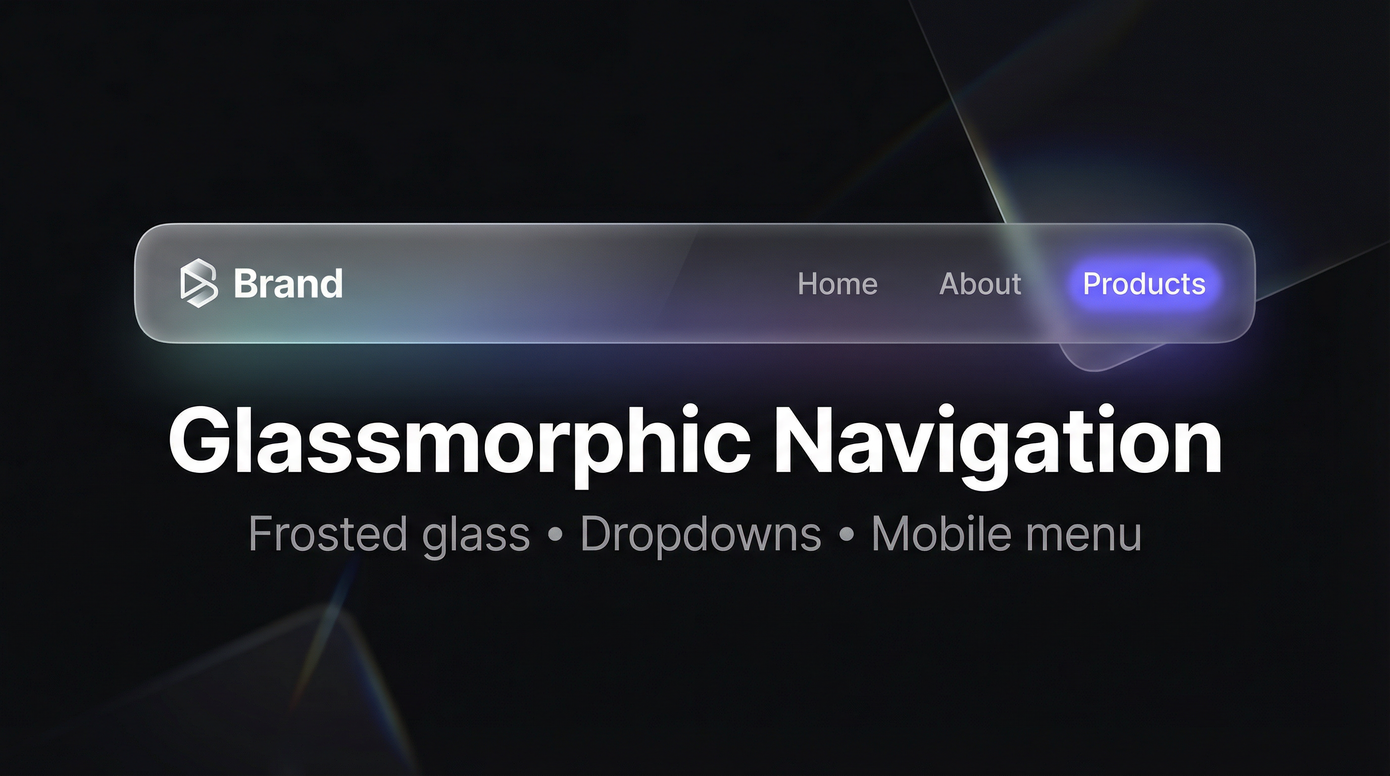
Build a modern navigation bar with a frosted glass effect using backdrop-filter: blur(), a subtle gradient overlay, and a floating bar style. Includes smooth dropdown animations, active state indicators, and a mobile hamburger menu with open/close transition—all achievable with HTML and CSS.
HTML Structure
Use a <nav> with a container for logo and links. For dropdowns, nest a list inside a parent item. For mobile, add a checkbox and a label that toggles the menu visibility.
<nav class="nav-bar">
  <div class="nav-container">
    <a href="/" class="nav-logo">Brand</a>
    <input type="checkbox" id="nav-toggle" class="nav-toggle" />
    <label for="nav-toggle" class="nav-hamburger" aria-label="Menu">...</label>
    <ul class="nav-menu">
      <li><a href="/" class="active">Home</a></li>
      <li class="has-dropdown">
        <a href="#">Products</a>
        <ul class="dropdown">...</ul>
      </li>
    </ul>
  </div>
</nav>
CSS: Glass effect and floating bar
Apply a semi-transparent background, backdrop-filter: blur(), and a light gradient overlay so the bar reads as frosted glass. Use a max-width container, padding, border-radius, and box-shadow so it appears to float above the page.
.nav-bar {
  position: sticky;
  top: 1rem;
  margin: 0 1rem;
}

.nav-container {
  background: rgba(255, 255, 255, 0.08);
  backdrop-filter: blur(12px);
  -webkit-backdrop-filter: blur(12px);
  border: 1px solid rgba(255, 255, 255, 0.1);
  border-radius: 16px;
  box-shadow: 0 8px 32px rgba(0, 0, 0, 0.2);
}
Dropdown and active state
Show dropdowns on hover with opacity and transform transitions. Style the current page link with a background pill or bottom border using a class like .active.
Mobile hamburger
Hide the desktop menu on small screens and show a hamburger button that toggles a checkbox. Use the :checked state to show the menu and animate the icon to an X for a clear open/close transition.