Floating Action Arc Menu
A premium, glassmorphic Floating Action Button (FAB) that fans out into an elegant arc. Features a sleek dark mode aesthetic, smooth hardware-accelerated animations, and ambient glow effects.
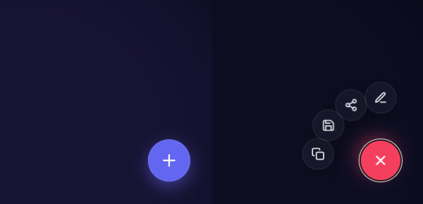
Elevate your user interface with this ultra-modern, minimal ”Floating Action Arc” menu. Moving away from standard linear reveals, this snippet uses sleek glassmorphism, dynamic rotational math, and a subtle backdrop blur to create a highly premium, cinematic interaction experience.
Design Highlights
- Fluid Arc Reveal: Secondary action buttons fan out in a perfectly calculated arc, creating a natural and satisfying motion trajectory.
- Deep Dark Aesthetic: Features ambient light orbs, deep slate backgrounds, and frosted glass elements (
backdrop-filter) for incredible depth. - Staggered Hardware Animation: Uses
cubic-beziereasing andtransition-delaystagger effects to make the icons pop into existence one by one. - Cinematic Backdrop: A soft, blurred overlay fades in behind the menu, absorbing the background to eliminate distractions.
- Smart Tooltips: Elegant, minimalist tooltips that smoothly slide out when hovering over an action item.
Code Snippet
HTML Structure
The structure includes a backdrop overlay wrapper, the main trigger button, and a container holding the custom SVG-based action items.
<div class="fab-wrapper" id="fabWrapper">
  <!-- Cinematic Backdrop Overlay -->
  <div class="fab-backdrop" id="fabBackdrop"></div>

  <div class="fab-menu">
    <!-- Action Items with --i index for stagger logic -->
    <button class="fab-action" style="--i: 0;">
      <svg class="icon" viewBox="0 0 24 24" fill="none" stroke="currentColor" stroke-width="2" stroke-linecap="round" stroke-linejoin="round"><path d="M12 20h9"></path><path d="M16.5 3.5a2.121 2.121 0 0 1 3 3L7 19l-4 1 1-4L16.5 3.5z"></path></svg>
      <span class="fab-tooltip">Edit</span>
    </button>
    <button class="fab-action" style="--i: 1;">
      <svg class="icon" viewBox="0 0 24 24" fill="none" stroke="currentColor" stroke-width="2" stroke-linecap="round" stroke-linejoin="round"><circle cx="18" cy="5" r="3"></circle><circle cx="6" cy="12" r="3"></circle><circle cx="18" cy="19" r="3"></circle><line x1="8.59" y1="13.51" x2="15.42" y2="17.49"></line><line x1="15.41" y1="6.51" x2="8.59" y2="10.49"></line></svg>
      <span class="fab-tooltip">Share</span>
    </button>

    <!-- Main Toggle Button -->
    <button class="fab-trigger" id="fabTrigger">
      <svg class="plus-icon" viewBox="0 0 24 24" fill="none" stroke="currentColor" stroke-width="2" stroke-linecap="round" stroke-linejoin="round"><line x1="12" y1="5" x2="12" y2="19"></line><line x1="5" y1="12" x2="19" y2="12"></line></svg>
    </button>
  </div>
</div>
CSS Variables & Arc Logic
We use CSS variables to manage the glass effect, scaling, and the dynamic trigonometry that positions the buttons perfectly.
:root {
  --primary-color: #6366f1;
  --danger-color: #f43f5e;
  --glass-bg: rgba(255, 255, 255, 0.04);
  --glass-border: rgba(255, 255, 255, 0.08);
  --fab-radius: 95px; /* Distance from main FAB */
  --anim-curve: cubic-bezier(0.34, 1.56, 0.64, 1);
}

.fab-action {
  /* ...Base formatting, absolute position, size... */
  opacity: 0;
  /* Start hidden underneath the main button */
  transform: translate(0, 0) scale(0) rotate(-180deg);
  transition: all 0.5s var(--anim-curve);
}

/*
  Calculated Arc Positioning
  Using --i to step through angles (-90deg straight up, stepping by -28deg)
*/
.fab-wrapper.is-open .fab-action {
  opacity: 1;
  transform:
    rotate(calc(-90deg + (var(--i) * -28deg)))
    translate(var(--fab-radius))
    rotate(calc(90deg - (var(--i) * -28deg)))
    scale(1);
}

/* Stagger Animations */
.fab-wrapper.is-open .fab-action:nth-child(1) { transition-delay: 0.00s; }
.fab-wrapper.is-open .fab-action:nth-child(2) { transition-delay: 0.05s; }
JavaScript Toggle Logic
A lightweight, accessible script toggles the active state on the wrapper, which orchestrates the complete animation sequence. It includes clicking the backdrop or pressing ‘Escape’ to dismiss.
document.addEventListener("DOMContentLoaded", () => {
  const trigger = document.getElementById("fabTrigger");
  const wrapper = document.getElementById("fabWrapper");
  const backdrop = document.getElementById("fabBackdrop");

  const toggleMenu = () => {
    wrapper.classList.toggle("is-open");
  };

  trigger.addEventListener("click", toggleMenu);
  backdrop.addEventListener("click", toggleMenu);

  // Close menu gracefully via keyboard
  document.addEventListener("keydown", (e) => {
    if (e.key === "Escape" && wrapper.classList.contains("is-open")) {
      toggleMenu();
    }
  });
});
This snippet ships with everything you need, including fluid CSS variables that let you alter the radius curve, spacing, and transition speeds entirely from the CSS.