Bento Grid Layout System
A modern, asymmetric bento box grid layout featuring various cell sizes, smooth hover animations, 3D tilt effects, and a spotlight hover interaction. Fully responsive and accessible.
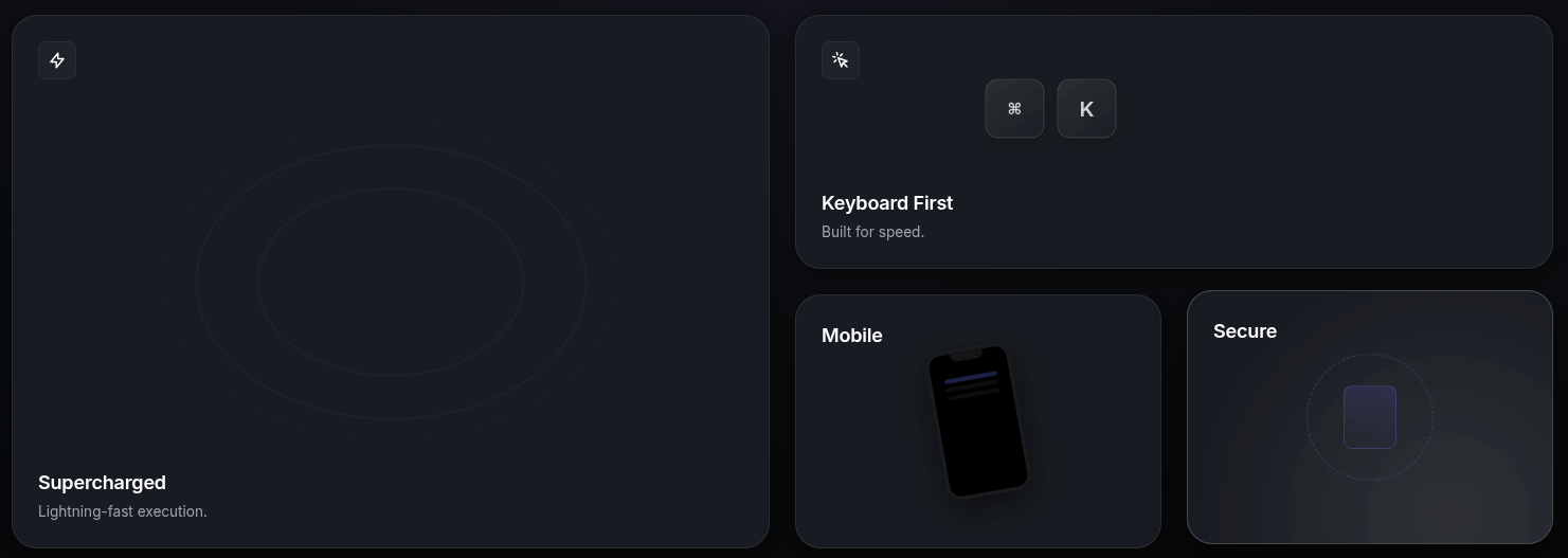
Create a stunning, premium functional interface with this Bento Grid Layout system. Inspired by modern dashboard designs, this layout uses CSS Grid for complex asymmetric arrangements and JavaScript for immersive 3D tilt and spotlight effects.
HTML Structure
The structure uses a main grid container with various card sizes defined by helper classes (col-span-2, row-span-2).
<div class="container">
  <div class="bento-grid">

    <!-- Large Feature Card (2x2) -->
    <div class="bento-card col-span-2 row-span-2">
      <div class="bento-card-bg-icon">🚀</div>
      <div class="card-content">
        <div class="card-icon">⚡</div>
        <h3 class="card-title">Supercharged Performance</h3>
        <p class="card-description">
          Experience lightning-fast speeds with our optimized engine.
        </p>
      </div>
    </div>

    <!-- Wide Card (2x1) -->
    <div class="bento-card col-span-2 row-span-1">
      <div class="card-content">
        <h3 class="card-title">Creative Control</h3>
        <p class="card-description">Customize every aspect of your workflow.</p>
      </div>
    </div>

    <!-- Additional cards... -->

  </div>
</div>
CSS Styling
We use CSS Grid for the layout and CSS Custom Properties (variables) for the spotlight effect logic. Glassmorphism is achieved via backdrop-filter.
:root {
  --bg-color: #0d0d0d;
  --card-bg: rgba(255, 255, 255, 0.03);
  --card-border: rgba(255, 255, 255, 0.1);
  --accent-color: #6366f1;
}

.bento-grid {
  display: grid;
  grid-template-columns: repeat(4, 1fr);
  grid-auto-rows: 200px;
  gap: 20px;
  perspective: 1000px; /* Essential for 3D tilt */
}

.bento-card {
  background: var(--card-bg);
  border: 1px solid var(--card-border);
  border-radius: 20px;
  position: relative;
  overflow: hidden; /* Contains the spotlight */
  transform-style: preserve-3d;
  transition: transform 0.1s ease-out;
}

/* Spotlight Effect Gradient */
.bento-card::before {
  content: "";
  position: absolute;
  top: 0; left: 0; right: 0; bottom: 0;
  background: radial-gradient(
    800px circle at var(--mouse-x, 50%) var(--mouse-y, 50%),
    rgba(255, 255, 255, 0.06),
    transparent 40%
  );
  opacity: 0;
  transition: opacity 0.3s ease;
  pointer-events: none;
}

.bento-card:hover::before {
  opacity: 1;
}
JavaScript Implementation
The JavaScript handles two key effects:
- Spotlight Tracking: Updates
--mouse-xand--mouse-yvariables based on cursor position relative to the card. - 3D Tilt: Calculates a rotation transform based on how far the cursor is from the center of the card.
document.addEventListener("DOMContentLoaded", () => {
  const cards = document.querySelectorAll(".bento-card");

  cards.forEach((card) => {
    card.addEventListener("mousemove", (e) => {
      const rect = card.getBoundingClientRect();
      const x = e.clientX - rect.left;
      const y = e.clientY - rect.top;

      // Spotlight coordinates
      card.style.setProperty("--mouse-x", `${x}px`);
      card.style.setProperty("--mouse-y", `${y}px`);

      // Tilt logic
      const centerX = rect.width / 2;
      const centerY = rect.height / 2;
      const rotateX = -1 * ((y - centerY) / centerY) * 10; // Max 10deg
      const rotateY = ((x - centerX) / centerX) * 10;

      card.style.transform = `
        perspective(1000px)
        rotateX(${rotateX}deg)
        rotateY(${rotateY}deg)
        scale3d(1.02, 1.02, 1.02)
      `;
    });

    card.addEventListener("mouseleave", () => {
      // Reset transform
      card.style.transform = `
        perspective(1000px)
        rotateX(0deg)
        rotateY(0deg)
        scale3d(1, 1, 1)
      `;
    });
  });
});