Animated Gliding Tab Navigation
A premium, sleek tab navigation featuring a fluid gliding background highlight, content fade transitions, URL hash routing, and native mobile swipe gestures.
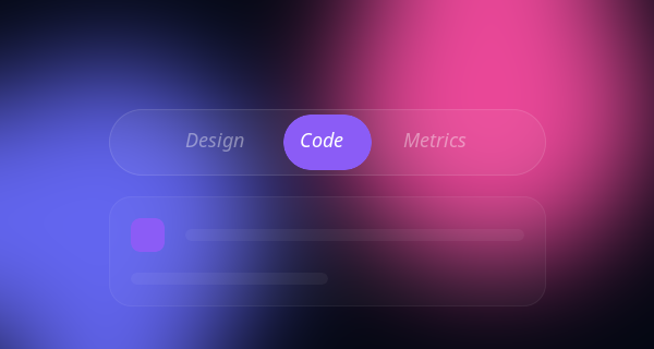
Ditch static, boring tab clicks with this ultra-modern, sexy tab navigation component. This resource includes 4 distinct variations, all powered by a single scalable JavaScript class.
The 4 Variations Included:
- The Gliding Pill: An absolutely positioned fluid glowing gradient background.
- Minimalist Underline: A clean 2px sliding bottom border highlight.
- Vertical Sidebar Morph: A flex-column dashboard style vertical navigation.
- Floating Segmented Control: An iOS-inspired inset segmented style picker.
Design Highlights Across All Styles
- Fluid Physics: Hardware-accelerated transforms fluidly move the highlight pill/line with a luxurious
cubic-bezier(0.34, 1.56, 0.64, 1)easing curve! - Silky Content Transitions: Content panels fade in while elegantly sliding up
translateY, creating a highly polished feel. - Mobile-First Swipe Gestures: Fully supports native mobile touch-swiping across the content area to navigate between tabs using JavaScript
touchstartandtouchend. - Glassmorphic Container: Deep dark aesthetics with subtle frosted glass and ambient glows give it a premium, futuristic vibe.
Code Snippet
HTML Structure
The markup separates the tab controls (buttons) from the content panels, wrapping them in accessible semantic containers.
<div class="tabs-container">
  <!-- Tab Controls -->
  <div class="tabs-nav" role="tablist">
    <div class="tab-glider" id="glider"></div>
    <button class="tab-btn active" data-target="panel-1" role="tab" aria-selected="true">Design</button>
    <button class="tab-btn" data-target="panel-2" role="tab" aria-selected="false">Code</button>
    <button class="tab-btn" data-target="panel-3" role="tab" aria-selected="false">Deploy</button>
  </div>

  <!-- Tab Content Area -->
  <div class="tabs-content-area" id="contentArea">
    <div class="tab-panel active" id="panel-1" role="tabpanel">
      <h3>Beautiful Interfaces</h3>
      <p>Content for the first tab fades in elegantly.</p>
    </div>
    <div class="tab-panel" id="panel-2" role="tabpanel">
      <h3>Clean Architecture</h3>
      <p>Content for the second tab over here.</p>
    </div>
    <div class="tab-panel" id="panel-3" role="tabpanel">
      <h3>Global Scale</h3>
      <p>Content for the third tab right here.</p>
    </div>
  </div>
</div>
CSS Styles & Animation
We use absolute positioning for the tab-glider and CSS variables to handle the transitions via JavaScript. The content panels use opacity and transform for smooth entry visually.
.tabs-nav {
  position: relative;
  display: inline-flex;
  background: rgba(255, 255, 255, 0.05); /* Dark Glass */
  border-radius: 99px;
  padding: 0.5rem;
  margin-bottom: 2rem;
  border: 1px solid rgba(255, 255, 255, 0.1);
}

.tab-glider {
  position: absolute;
  top: 0.5rem;
  left: 0;
  height: calc(100% - 1rem);
  background: linear-gradient(135deg, #8b5cf6, #3b82f6);
  border-radius: 99px;
  /* Incredible fluid easing curve */
  transition: all 0.4s cubic-bezier(0.34, 1.56, 0.64, 1);
  box-shadow: 0 4px 15px rgba(59, 130, 246, 0.4);
  z-index: 1;
}

.tab-btn {
  position: relative;
  z-index: 2; /* Sits above the glider */
  padding: 0.75rem 2rem;
  color: #94a3b8;
  font-weight: 500;
  background: none;
  border: none;
  cursor: pointer;
  border-radius: 99px;
  transition: color 0.3s ease;
}

.tab-btn.active {
  color: #ffffff;
}

/* Content Panels */
.tab-panel {
  display: none;
  animation: fadeUp 0.5s cubic-bezier(0.16, 1, 0.3, 1) forwards;
}

.tab-panel.active {
  display: block;
}

@keyframes fadeUp {
  0% { opacity: 0; transform: translateY(10px); }
  100% { opacity: 1; transform: translateY(0); }
}
JavaScript: Gliding Math, Routing & Swiping
This highly optimized script calculates where the glider should move, syncs with the window URL hash, and detects horizontal swipes.
document.addEventListener("DOMContentLoaded", () => {
  const buttons = document.querySelectorAll(".tab-btn");
  const panels = document.querySelectorAll(".tab-panel");
  const glider = document.getElementById("glider");
  const contentArea = document.getElementById("contentArea");

  let currentIndex = 0;

  // Handles updating the visual glider and active classes
  const activateTab = (btn) => {
    // Math to move the pill precisely
    glider.style.width = `${btn.offsetWidth}px`;
    glider.style.transform = `translateX(${btn.offsetLeft}px)`;

    buttons.forEach(b => { b.classList.remove('active'); b.setAttribute('aria-selected', 'false') });
    panels.forEach(p => p.classList.remove('active'));

    btn.classList.add('active');
    btn.setAttribute('aria-selected', 'true');
    const target = btn.getAttribute("data-target");
    document.getElementById(target).classList.add('active');

    // Update hash for sharing
    history.replaceState(null, null, `#${target}`);
    currentIndex = Array.from(buttons).indexOf(btn);
  };

  // 1. Check URL hash on load
  const hash = window.location.hash.substring(1);
  const targetBtn = Array.from(buttons).find(b => b.getAttribute("data-target") === hash) || buttons[0];

  // Set initial position
  setTimeout(() => activateTab(targetBtn), 50);

  // 2. Click listeners
  buttons.forEach(btn => {
    btn.addEventListener("click", () => activateTab(btn));
  });

  // 3. Mobile Swipe Gestures
  let touchStartX = 0;
  let touchEndX = 0;

  contentArea.addEventListener('touchstart', e => { touchStartX = e.changedTouches[0].screenX; }, {passive: true});
  contentArea.addEventListener('touchend', e => {
    touchEndX = e.changedTouches[0].screenX;
    if (touchEndX < touchStartX - 50 && currentIndex < buttons.length - 1) {
      activateTab(buttons[currentIndex + 1]); // Swipe Left
    } else if (touchEndX > touchStartX + 50 && currentIndex > 0) {
      activateTab(buttons[currentIndex - 1]); // Swipe Right
    }
  }, {passive: true});

  // Recalculate size on window resize
  window.addEventListener('resize', () => activateTab(buttons[currentIndex]));
});
Drop this component directly into your web app to provide a premium, modern navigation experience that feels incredibly tactile and alive.