Animated Gradient Progress Bars
A comprehensive collection of modern progress indicators featuring animated gradient fills, glowing milestone markers, circular rings, and multi-segment bars with scroll-triggered animations.
Bring your data to life with this collection of highly polished, modern progress indicators. Designed with a sleek dark aesthetic, these animated bars use vibrant gradient fills, smooth easing, and interactive milestone markers to make progress tracking visually captivating.
Design Highlights
- Animated Gradient Fills: Progress bars feature a flowing gradient background (
background-positionanimation) that creates a continuous sense of movement. - Intersection Observer: Animations only trigger when the progress bars scroll into view, ensuring a dynamic reveal as users explore the page.
- Milestone Markers: Linear bars include subtly glowing nodes along the track to represent key stages or checkpoints.
- Circular Progress Rings: Uses SVG
<circle>elements with animatedstroke-dashoffsetfor perfectly smooth radial progress. - Multi-Segment Data: A split-bar design allowing you to showcase multiple data categories within a single continuous track.
Code Snippet
HTML Structure
The snippet includes a classic linear bar with markers, a multi-segment bar, and a scalable SVG circular ring.
<!-- 1. Linear Progress with Milestones -->
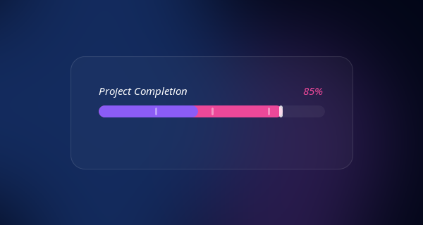
<div class="progress-wrap observer-trigger">
<div class="progress-header">
<span class="progress-label">Project Completion</span>
<span class="progress-percent" data-target="85">0%</span>
</div>
<div class="progress-track">
<div class="progress-fill gradient-flow" style="--progress: 85%;"></div>
<!-- Milestone Markers -->
<div class="milestone" style="left: 25%;"></div>
<div class="milestone" style="left: 50%;"></div>
<div class="milestone" style="left: 75%;"></div>
</div>
</div>
<!-- 2. Circular Progress Ring -->
<div class="circular-progress observer-trigger" data-target="72">
<svg width="120" height="120" viewBox="0 0 120 120">
<!-- Background Track -->
<circle cx="60" cy="60" r="54" class="ring-track"></circle>
<!-- Animated Fill -->
<circle cx="60" cy="60" r="54" class="ring-fill gradient-stroke" stroke-dasharray="339.29"></circle>
</svg>
<div class="circular-value">0%</div>
</div>CSS Variables & Animations
The sleek look relies on a continuous background shifting animation on the gradient, giving an illusion of energy flowing through the bar.
:root {
  --bg-color: #020617;
  --track-bg: rgba(255, 255, 255, 0.05);
  --glow: rgba(139, 92, 246, 0.5);
  --gradient-main: linear-gradient(90deg, #ec4899, #8b5cf6, #3b82f6, #ec4899);
}

.gradient-flow {
  background: var(--gradient-main);
  background-size: 300% 100%;
  animation: flowGradient 4s linear infinite;
}

@keyframes flowGradient {
  0% { background-position: 0% 50%; }
  100% { background-position: 100% 50%; }
}

/* Linear Bar Reset/Fill */
.progress-fill {
  height: 100%;
  width: 0%; /* Triggered by JS */
  border-radius: 99px;
  box-shadow: 0 0 20px var(--glow);
  transition: width 1.5s cubic-bezier(0.22, 1, 0.36, 1);
}

/* Circular svg magic */
.ring-fill {
  fill: none;
  stroke: url(#ringGradient); /* Defined in SVG defs */
  stroke-width: 8;
  stroke-linecap: round;
  /* dashoffset managed by JS */
  transition: stroke-dashoffset 1.5s cubic-bezier(0.22, 1, 0.36, 1);
  transform: rotate(-90deg);
  transform-origin: 50% 50%;
}
JavaScript Scroll Trigger Logic
Using IntersectionObserver, we ensure the elements smoothly count up and slide out only when the user scrolls to them.
const observer = new IntersectionObserver((entries) => {
  entries.forEach(entry => {
    if (entry.isIntersecting) {
      const el = entry.target;
      el.classList.add('is-visible');

      // Animate Linear Fills
      const fill = el.querySelector('.progress-fill');
      if (fill) fill.style.width = fill.style.getPropertyValue('--progress');

      // Animate Numbers
      // Animate Circular dashoffset...

      observer.unobserve(el); // Run once
    }
  });
}, { threshold: 0.2 });

document.querySelectorAll('.observer-trigger').forEach(el => observer.observe(el));
This snippet offers lightweight components that can be easily customized. Just drop the HTML into your UI, adjust the CSS gradient colors to match your brand, and watch your metrics shine.