3D Flip Card with Perspective
3D flip cards that rotate on hover or click with realistic perspective. Front and back content areas, smooth transforms, shadow adjustments during flip, and optional auto-flip timer—pure HTML and CSS.
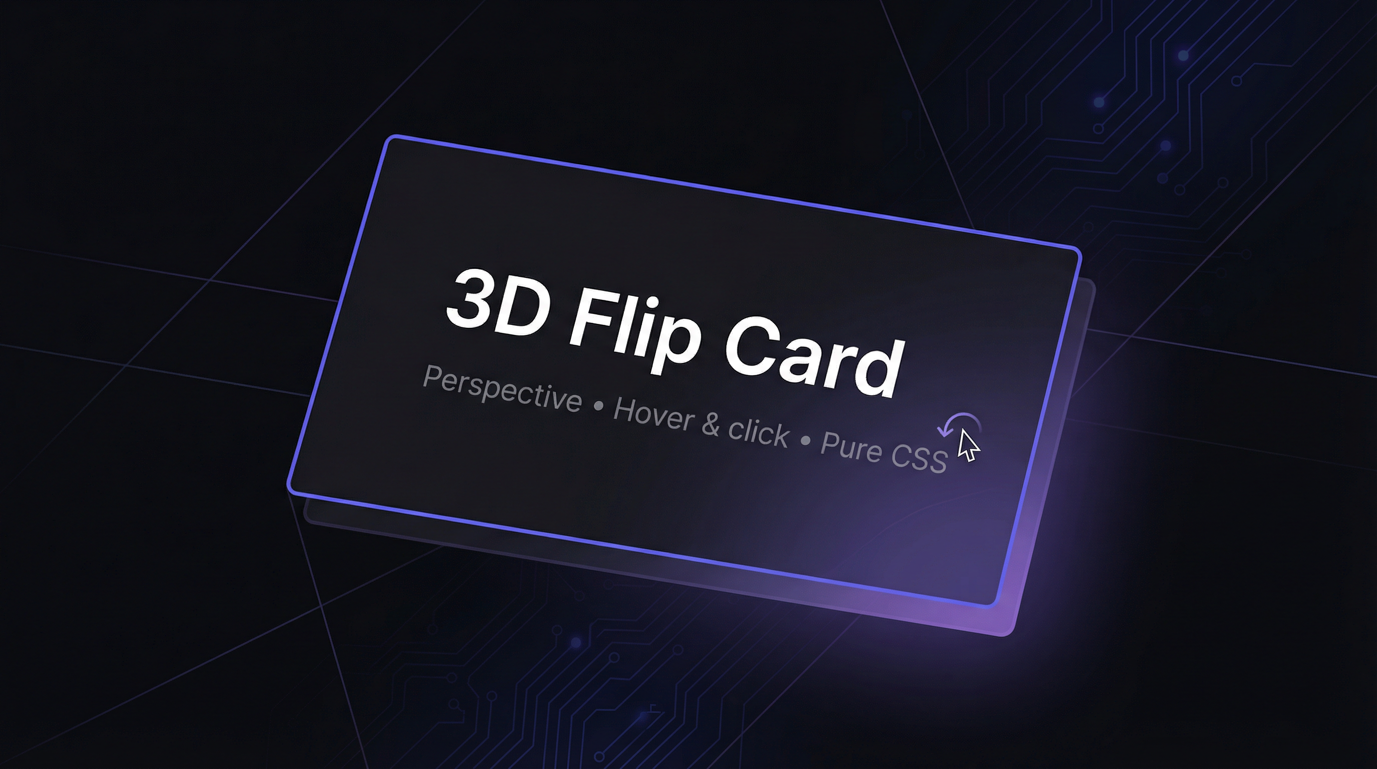
Create 3D flip cards with realistic perspective using only HTML and CSS. Cards rotate on hover or click (checkbox hack), with smooth transforms, dynamic shadows during the flip, and an optional auto-flip animation—no JavaScript required.
HTML Structure
Each card uses a wrapper with perspective, an inner container with transform-style: preserve-3d, and two faces (front and back) with backface-visibility: hidden.
<div class="card-wrap" style="--perspective: 1000px;">
  <div class="card-inner">
    <div class="card-face card-front">
      <h3>Front</h3>
    </div>
    <div class="card-face card-back">
      <p>Back content</p>
    </div>
  </div>
</div>
For click-to-flip, wrap the card in a label and add a hidden checkbox so :checked drives the flip state.
CSS: Perspective and flip
Set perspective on the parent and use transform-style: preserve-3d on the inner container. Rotate the inner on hover (or when the checkbox is checked) and position the back face with rotateY(180deg) so it appears when the card flips.
.card-wrap {
  perspective: var(--perspective, 1000px);
}

.card-inner {
  position: relative;
  width: 100%;
  height: 100%;
  transform-style: preserve-3d;
  transition: transform 0.7s cubic-bezier(0.4, 0, 0.2, 1),
              box-shadow 0.7s ease;
}

.card-wrap:hover .card-inner {
  transform: rotateY(180deg);
}

.card-face {
  position: absolute;
  inset: 0;
  backface-visibility: hidden;
}

.card-back {
  transform: rotateY(180deg);
}
Shadow during flip
Transition box-shadow on .card-inner so the shadow shifts as the card rotates—e.g. from a shadow behind the front to a shadow behind the back—for a more realistic feel.
Auto-flip with CSS
Use a keyframe animation that holds front, rotates to back, holds, then rotates back. Apply it to a card with a class like .card-auto and set animation with the desired duration and iteration count.
You can combine hover, click (via checkbox), and auto-flip in the same page for a modern, creative showcase.